KoTUITUI
Team Textura
Daneilla Tunai Graphic Designer Creative Director
Sarai Reid Team Lead UI/UX Designer UX Researcher
Theo Lawry Motion Designer
Aliaksandr Kruhlou UI/UX Designer Producer
Role
Graphic Designer Creative Director
Tools
Illustrator Photoshop Figma
Deliverables
Posters Bus Shelter Screens Social Media
Timeline
8 weeks

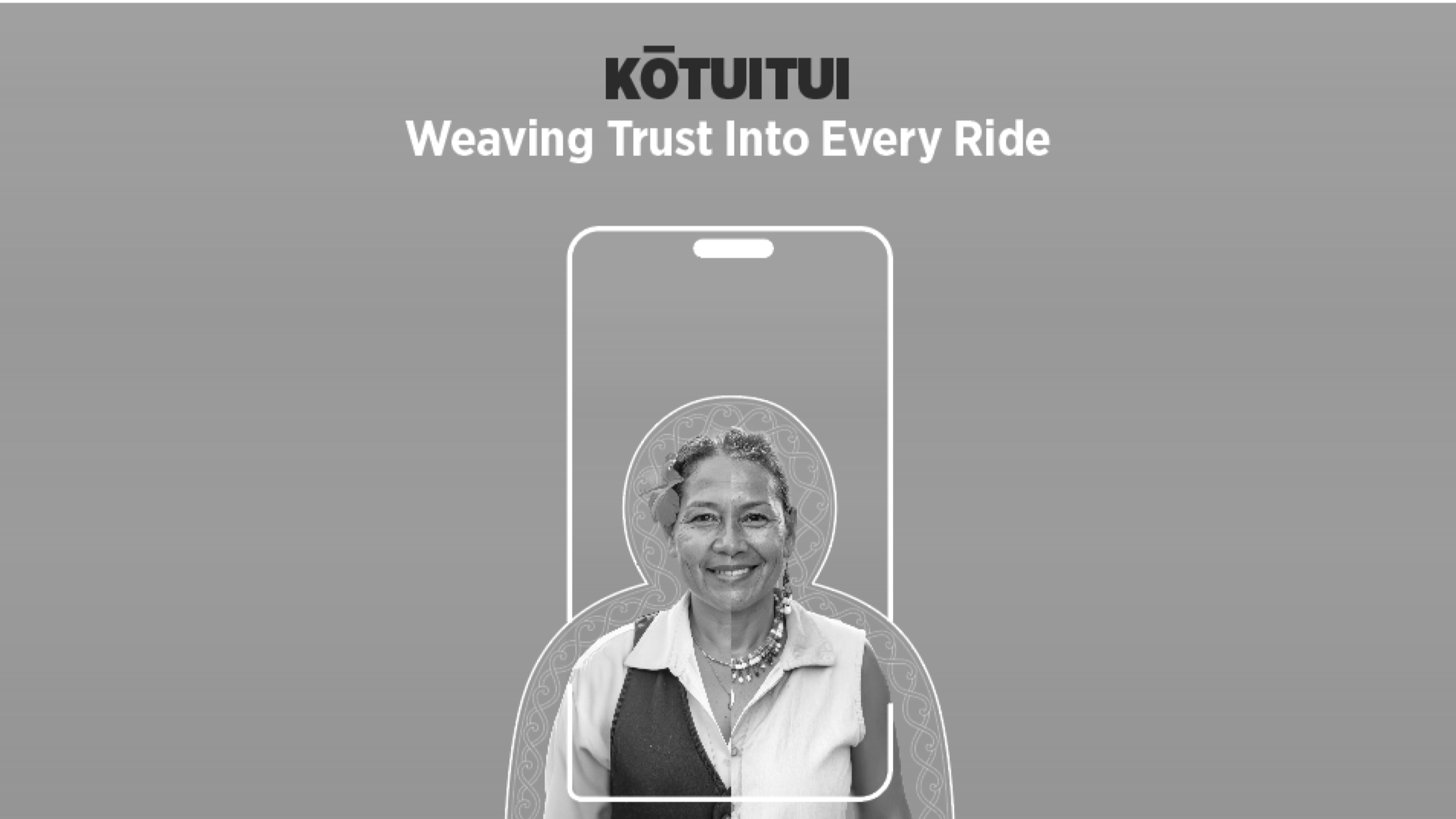
A campaign designed to strengthen trust between Aucklanders and Auckland Transport


Aucklanders are becoming increasingly concerned about safety on public transport, affecting their confidence and comfort when travelling. Auckland Transport needs to improve both real and perceived safety while building greater trust in the network.
Our solution makes public transport feel more human, safe, and trustworthy by increasing the visibility and familiarity of Auckland Transport staff, helping reassure passengers, build trust, and reduce commuter anxiety across the network.
Process
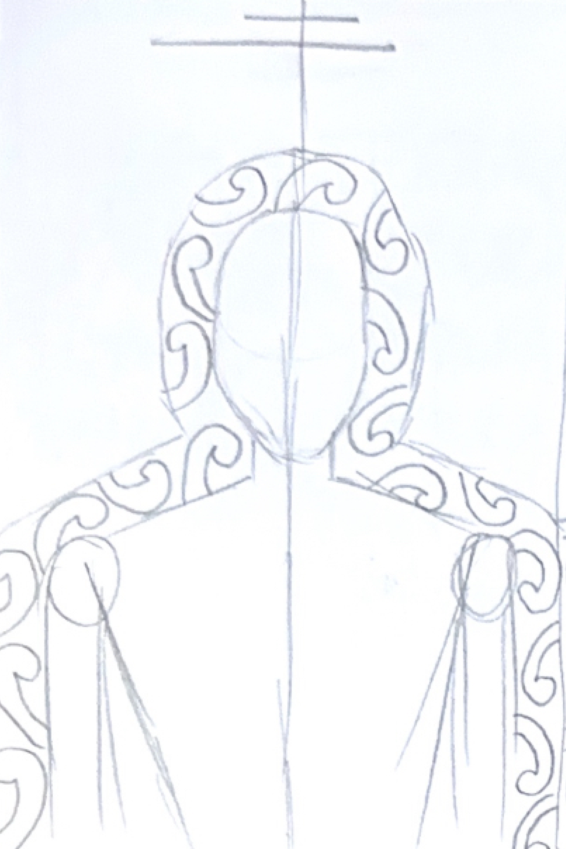


The process involved thumbnailing layout concepts and exploring Māori and Pacific motifs and patterns, experimenting with ways to integrate them throughout the designs to create a stronger sense of authenticity, cultural identity, and inclusivity.

outcome
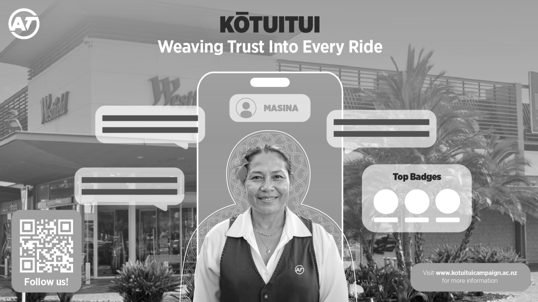
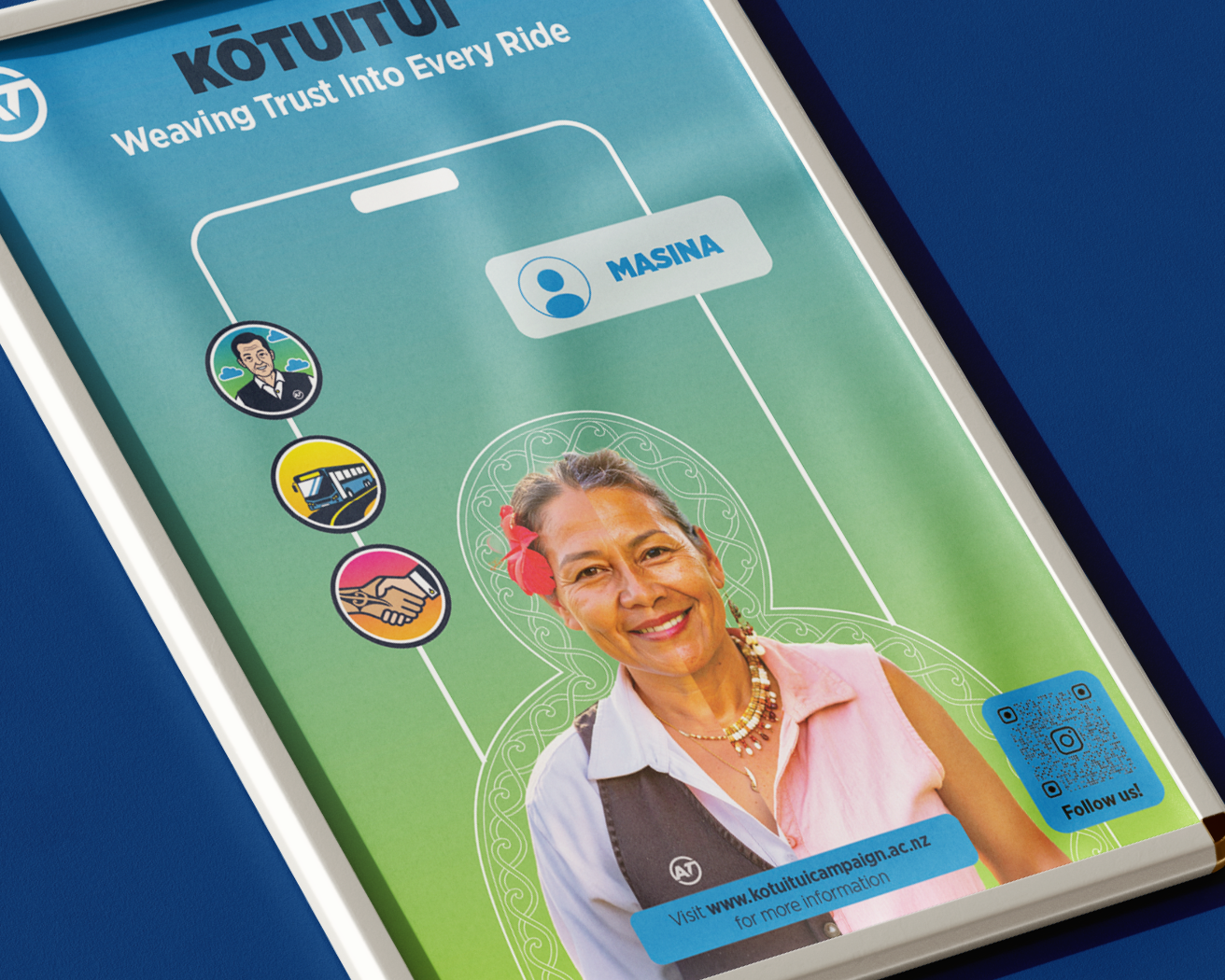
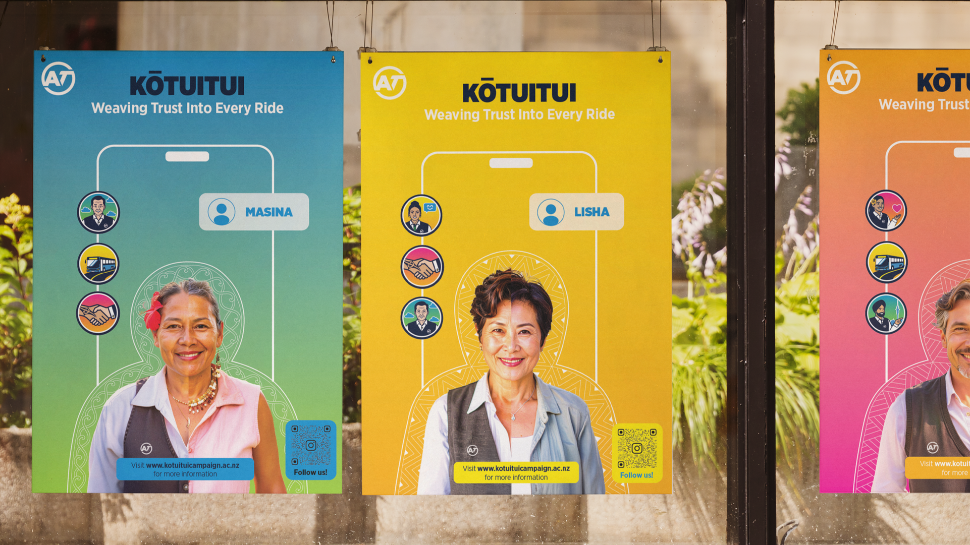
Kōtuitui was designed to improve Aucklanders’ sense of safety when using public transport through thoughtful, authentic, and intentional visuals placed in high-traffic city centre locations.
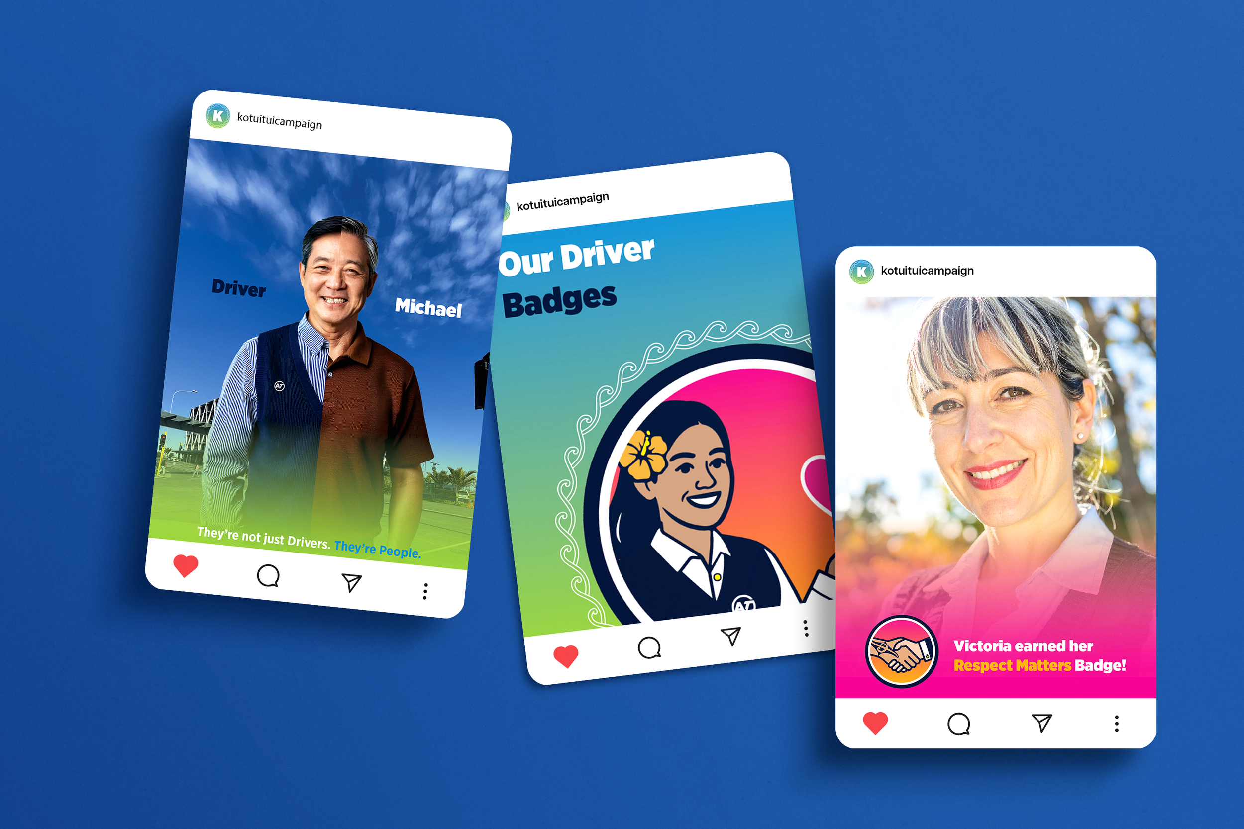
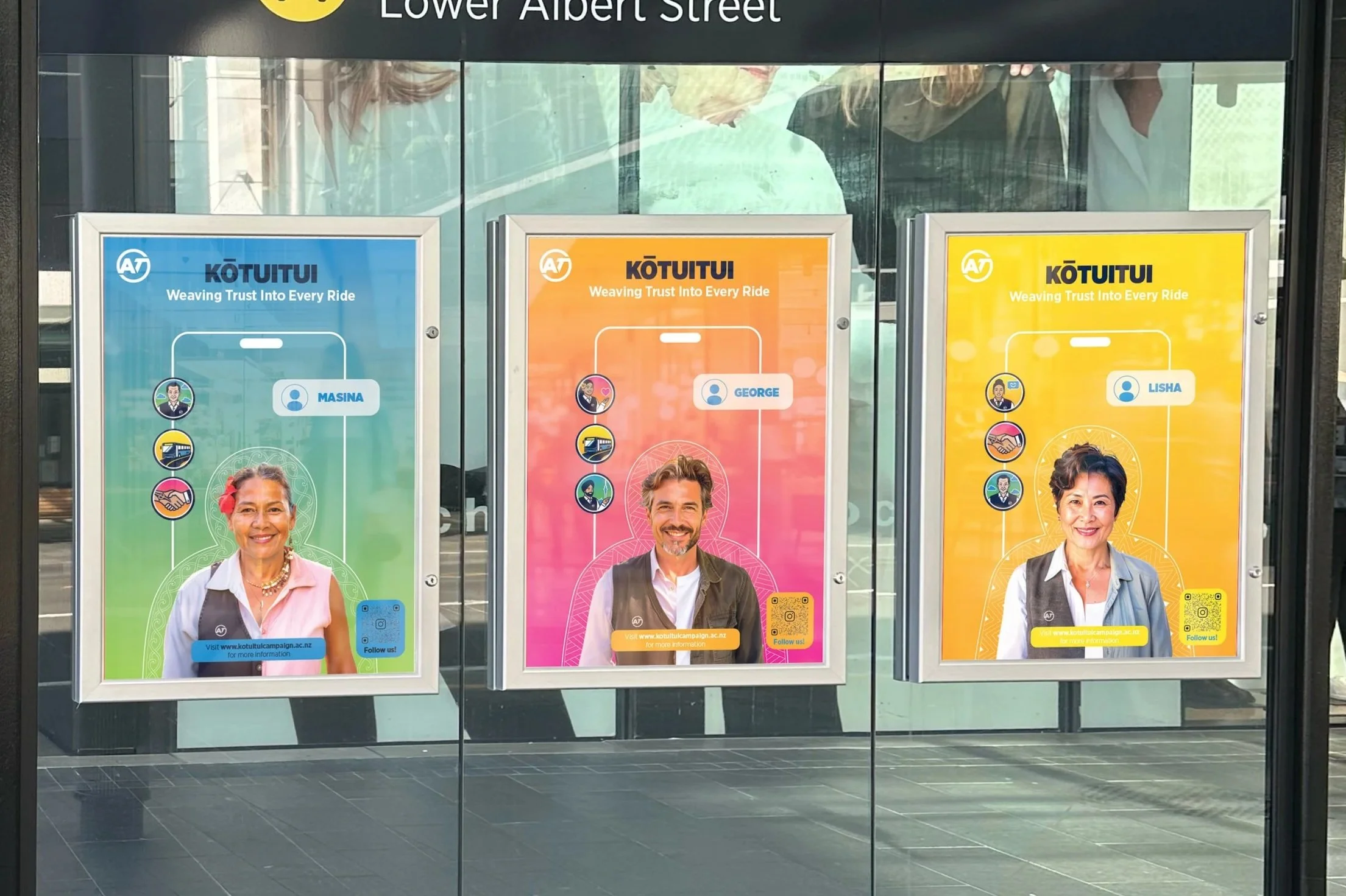
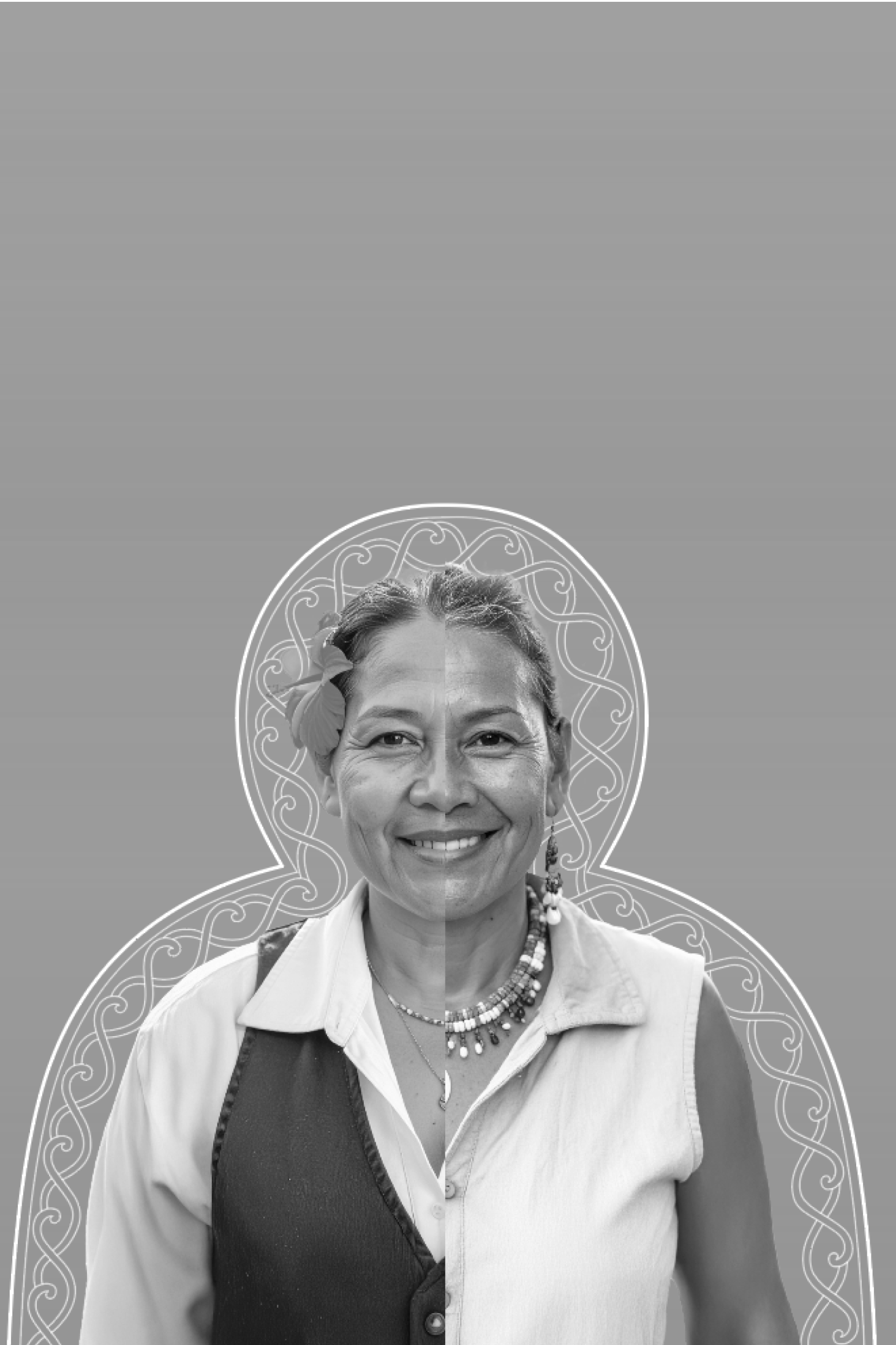
The campaign includes posters, bus shelter signage, and social media content that highlight bus drivers as real, relatable people, who are just like everyone else.
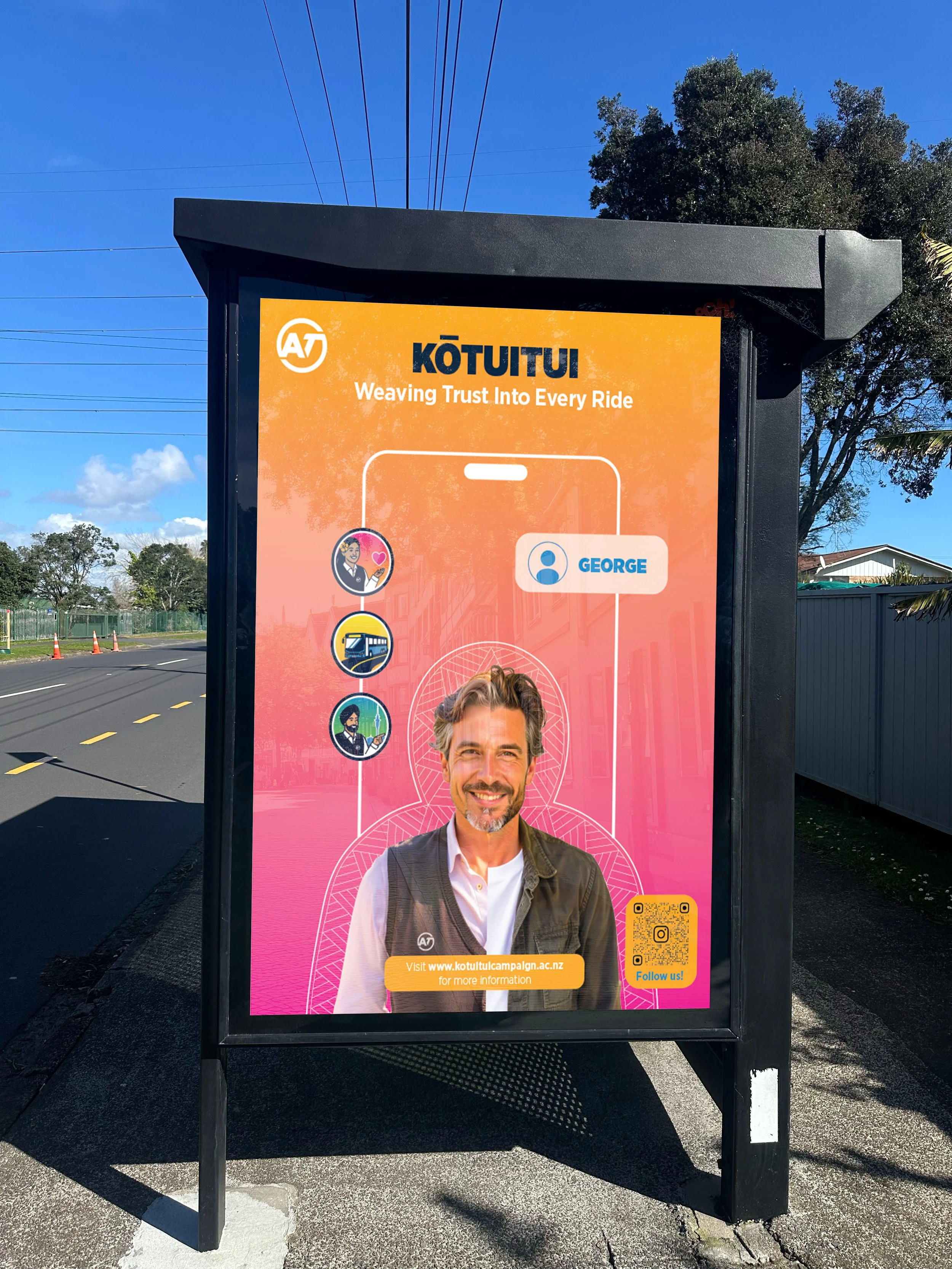
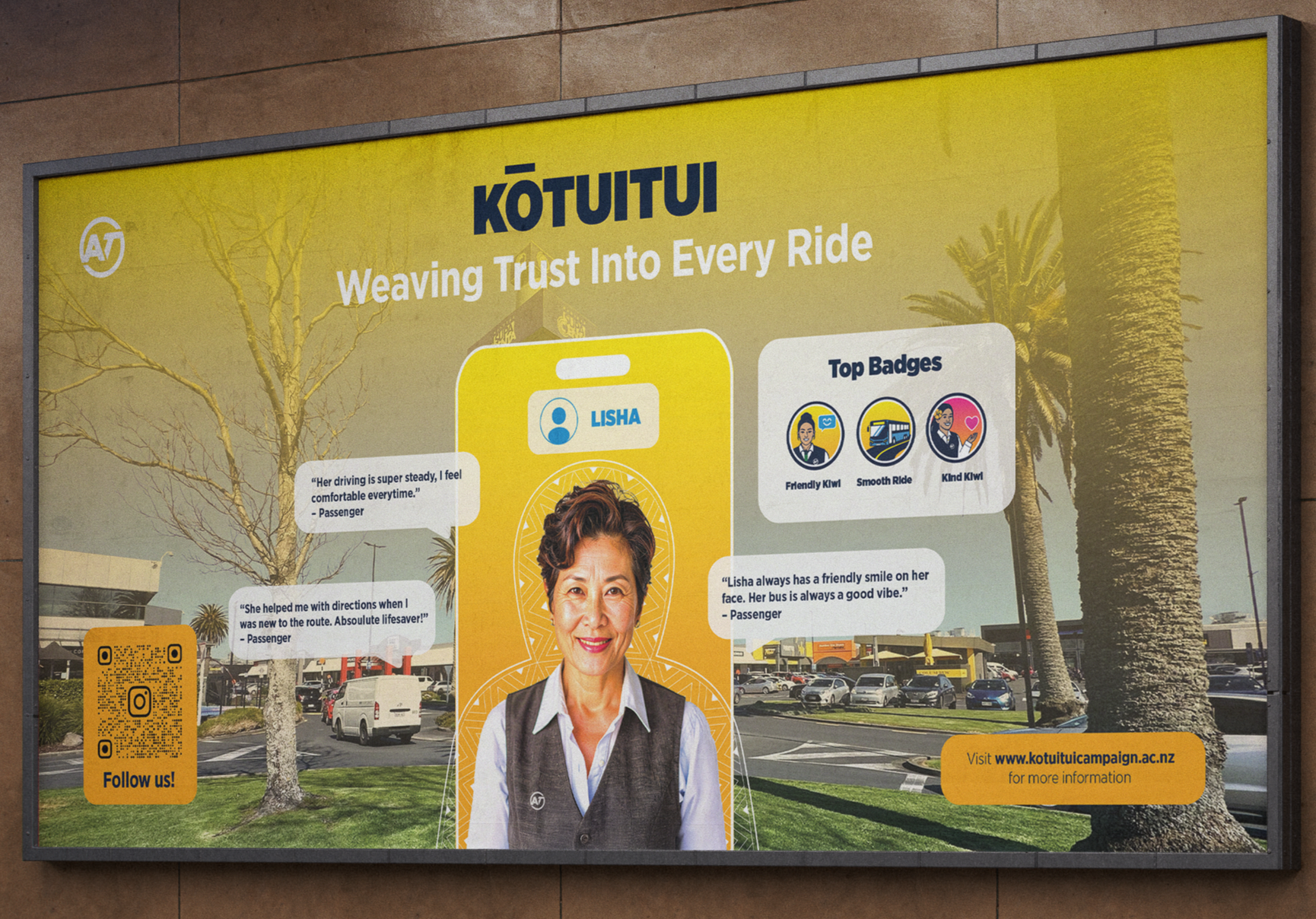
The designs showcase driver badges earned through positive rider feedback, allowing commuters to see and acknowledge their drivers before their journey, helping to create a more familiar, transparent, and emotionally safe travel experience.
1
2
3
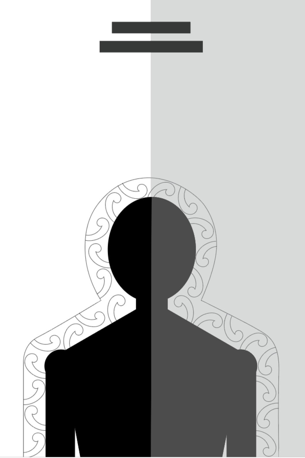
Each poster features different Māori and Pacific patterns that represents concepts and values. The “Pikorua” (1) represents two paths/lives interweaving, the “Niho Taniwha” (2) represents protection and strength, and the “Niho Mano” (3) represents strength and adaptability in Samoan culture.
As a group we decided that incorporating Māori and Pacific motifs and patterns were important to not only stay consistent with Auckland Transports brand, but we also believe that they would add a layer of humanness, authenticity and relatability to Auckland commuters.
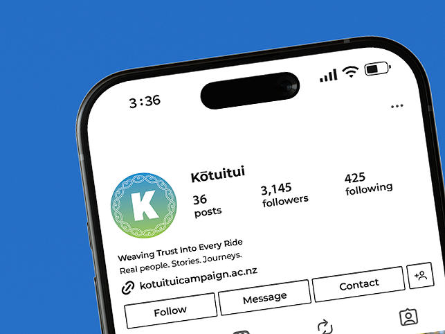
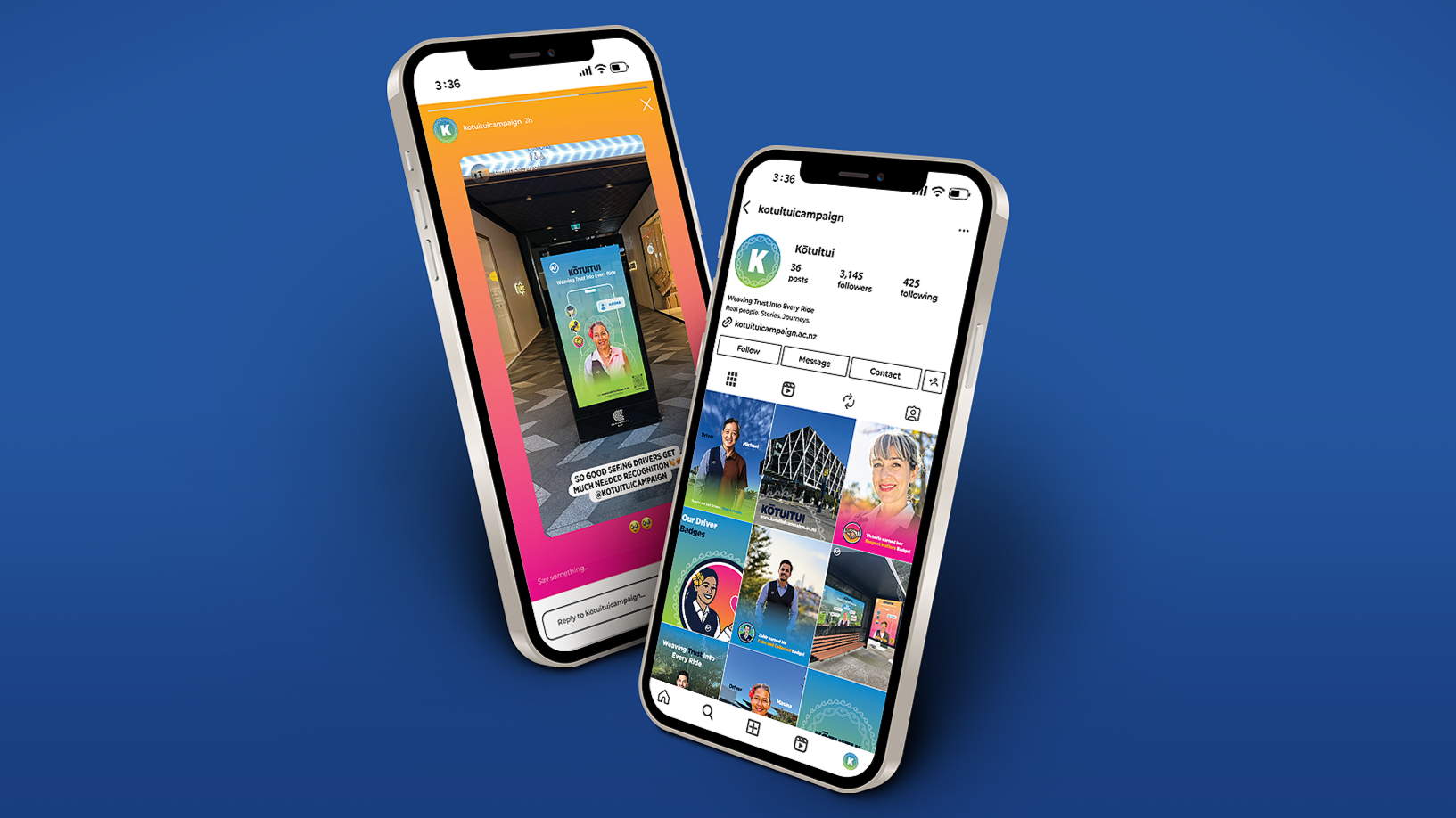
The social media platform was designed to keep riders updated on the campaign and notify them when their favourite drivers earn new badges. This helps drive engagement, encourages participation in the campaign, and motivates riders to recognise and reward their drivers through the badge system.